Apartment Monument Sign - revamp
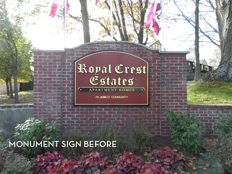
Happy Friday! Today I wanted to share a project I completed for an apartment complex in Rhode Island. Their front entrance monument sign was in desperate need of a refresh. Here is the faded brick sign before I got my hands on it:
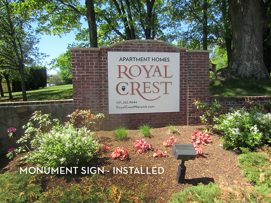
A new logo was being rolled out for the community, so one of my directives was to make sure that was prominent, as well as keeping some contact info on the sign. Because this project did not have a huge budget, I devised a plan to replace the plaque only, and add dimensional lettering. I thought a cream background with red text would pop better off of the red brick. Here was my initial design:
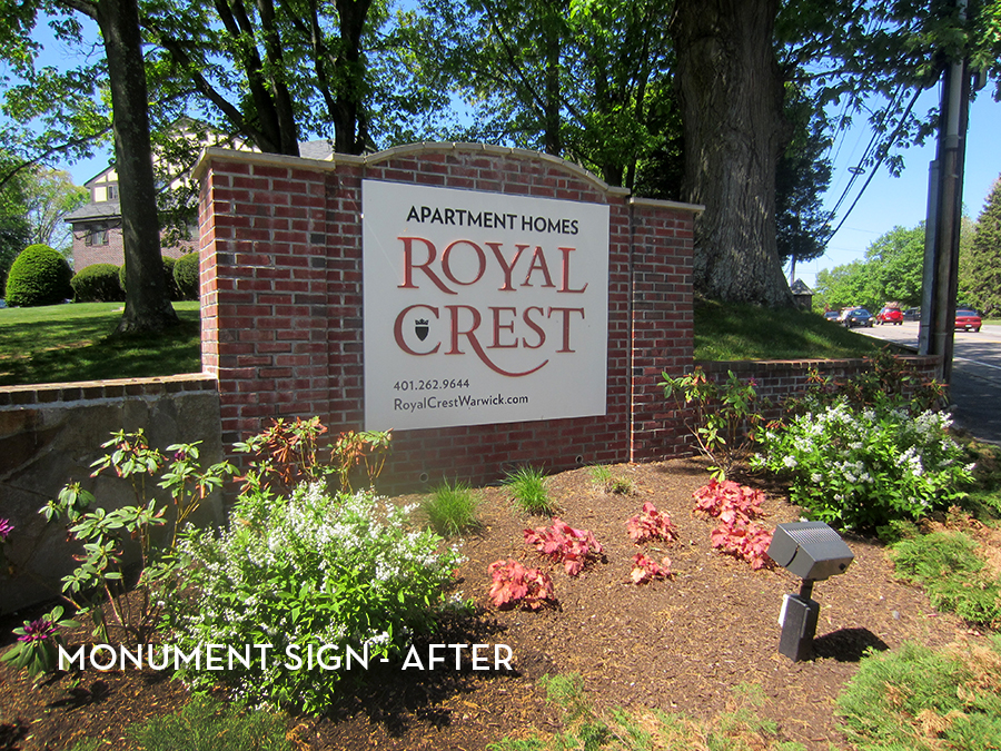
The community loved the design and we were ready to install. Here are a few shots of the final product:
A clean and simple solution to updating the first impression a customer has when driving up to the property. Graphic design at its finest!


