New Product Alert - Cutting Boards! And a GIVEAWAY!

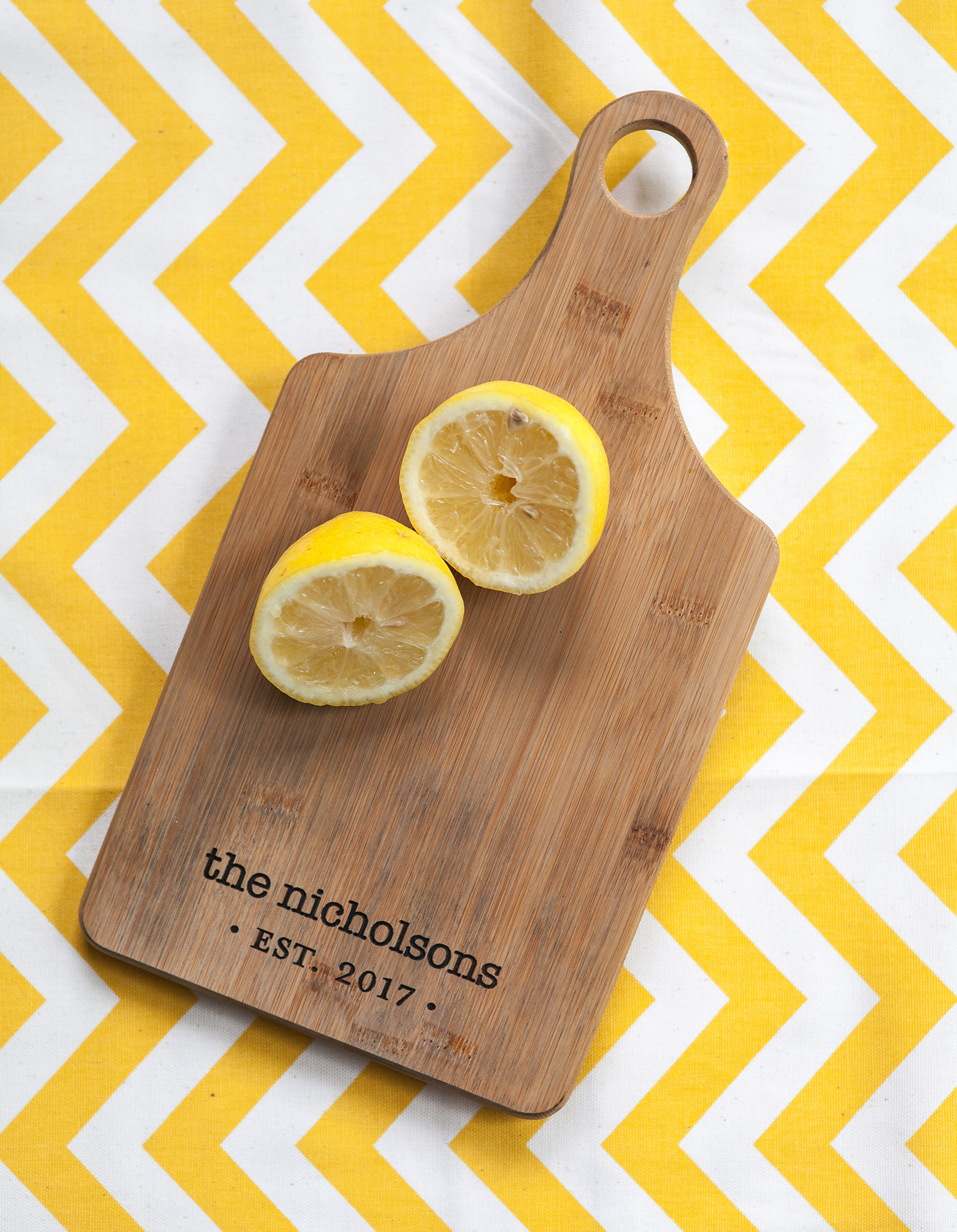
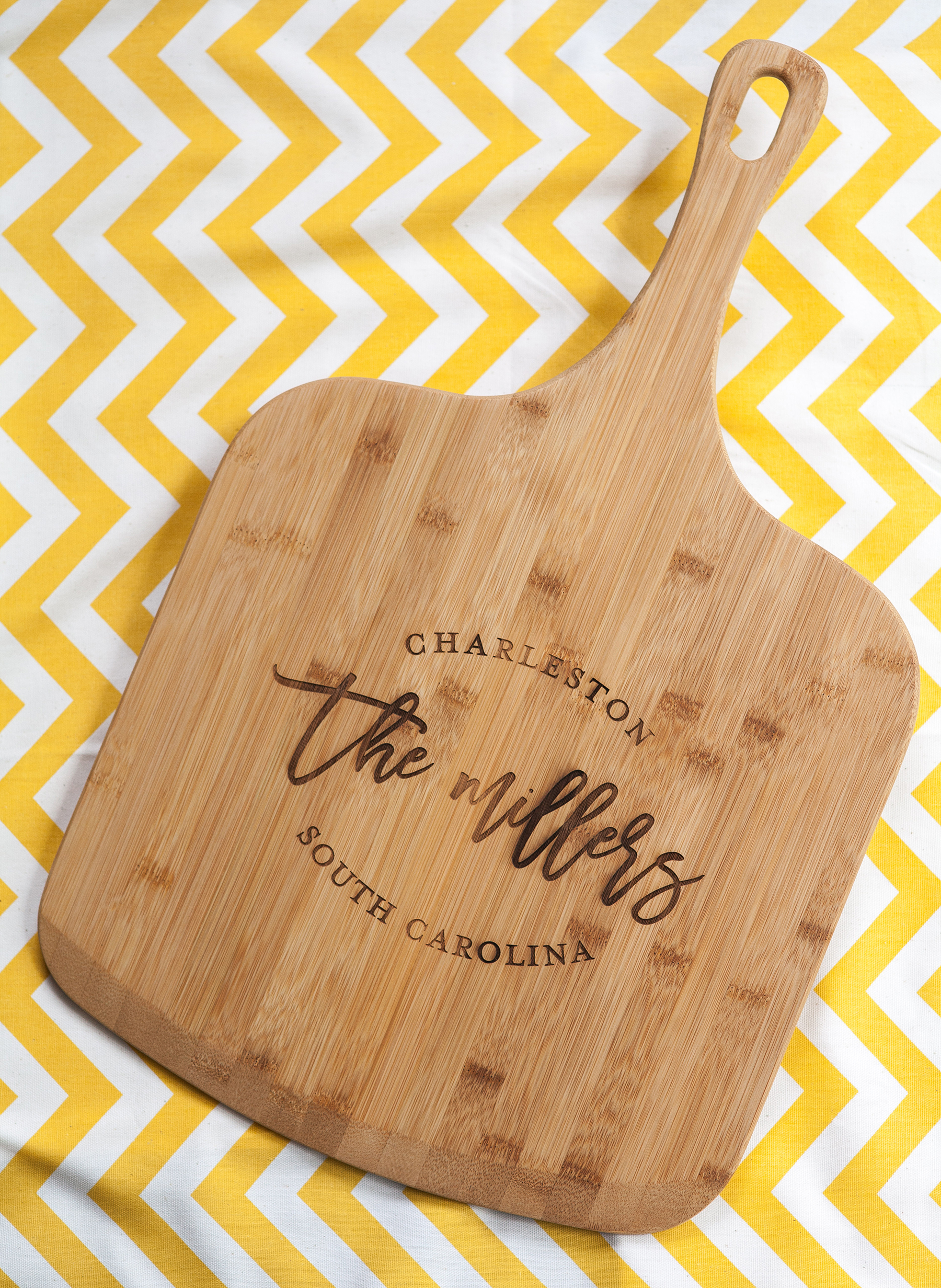
I am so pumped to be sharing this post today. Its my first GIVEAWAY! I have been so fortunate since launching my Etsy Shop back in 2012 that I wanted to do a little something to give back to all my great customers. This also coincides with the launch of some new products for me, these gorgeous cutting boards! 

These cutting boards make an awesome anniversary, Christmas or engagement present. I love the idea of displaying these in your kitchen as a newlywed. I seem to have a thing for cutting boards, as I literally have 5 on display in my own home.

Here's how to win a free personalized cutting board:
1. Follow me on Instagram
2. Like the cutting board photo
3. Tag 2 friends in the comments.
And just like that you are entered to win! I will select a winner at random on 7/27. Good luck!

Weekly Recap - New Baby Shower designs in the shop

Howdy and Happy Friday! Just a quick check in to recap what I've been working on this week. I'm busy wrapping up some outstanding freelance projects in the hopes I can take it easy the last week before baby girl's due date. In addition to a Golf Tournament signage package, I wrapped up this logo: 

RookDesign-SummitWestLogo-final

This logo is for an apartment complex in Tampa, FL. I love the beachy elegant feel and hopefully can get my hands on some collateral for this property soon. I am also working on the invitation design for the American Cancer Society - Salt Lake City's annual gala. I shared the event logo on my Instagram here. Since we have a handful of elements to incorporate in to the invitation, I suggested a pocket folder. This blue number from CardsandPockets.com should do the trick. Crossing my fingers and toes I can get the team to splurge on a custom wax seal as the envelope closure. I mean, how gorgeous are these stamps??

The last image is from WaxSeals.com's instagram page. You have to go check it out, just a gorgeous feed full of fun wedding and stationary ideas. In addition to my freelance projects I am SO excited to launch a ton of new products in my Etsy Shop. For now, here is a sneak peek of the items to come:

Also new to the shop are some additional Baby Shower designs. I've been selling a ton of these A Baby is Brewing koozies lately, so I thought I should add a few more baby themed designs to my arsenal. Have a great weekend!

Friday Freebie - Love is Brewing 8x10" sign

Gearing up for a low key weekend around here. I feel like we have been going a mile a minute, having back to back visitors and heading up to the mountains for a few days so it will be nice to get reacquainted with my couch. :)

Sadly its been a minute since I've shared any freebies, so here is a new "Love Is Brewing" 8x10" print. This can be displayed near the bar, or on a table when guests walk in instructing them to grab a favor! 

I've done 3 options for you to choose from. The white distressed background seen above. A pale pink watercolor option and a chalkboard background. Get the files here:

1. Love is Brewing - White Distressed background
2. Love is Brewing - Pink Watercolor background
3. Love is Brewing - chalkboard background
ย 

Logo work lately....

Its been a fun and challenging few weeks putting together a variety of logo designs for some corporate clients. I have been working on a majority of Apartment Complex refreshes. This first batch of logos was sent over for an upscale retail and living area in Frisco, TX. 

The clients had asked for a bold design, possibly featuring an abstract symbol or directional lines. The first 2 clearly met that objective, while the second 2 options felt very North Dallas to me. Luckily I lived in Dallas for 7 years so I am familiar with this area. Ultimately the client settled on this logo, but I still like to show the process work! 

Next up on the list was a quaint property located in Manassas, Virginia. The town center has an old town Americana vibe complete with water tower. They wanted the logo to feel historic. Here was my first stab at the marks:

I thought the first option was a home run, but the clients felt drawn to option #2. I took the time to redraw their leasing office and highlight the architectural details to make it appear like an old bungalow. So we settled on a soft color palatte as well as a black and white option:

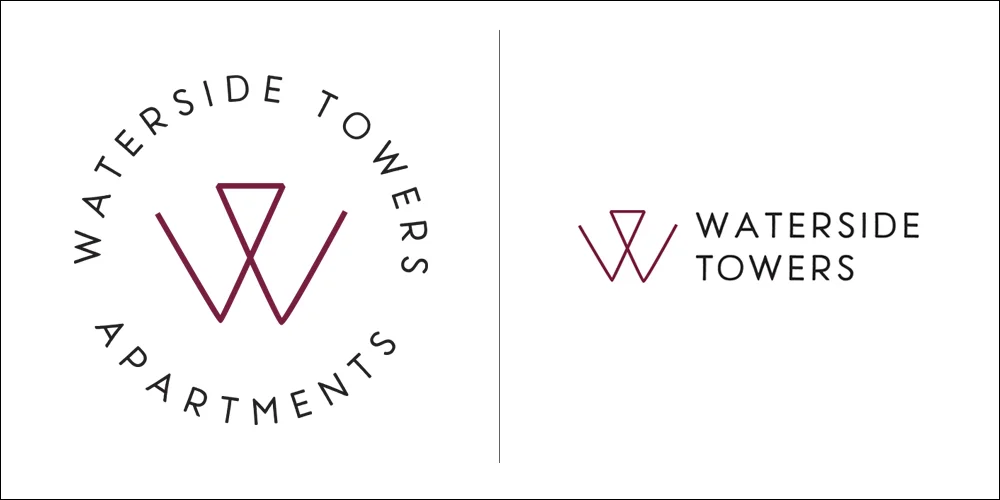
The next property, Waterside Towers is located in D.C. The team wanted a very urban vibe to match the newly renovated business center on site. I loved the idea of using a monogram to easily recognize the building. Hopefully this "W" makes its way on to way finding signage:

This last property was a bit of a heartbreaker. Also located in DC, the client mentioned an "optical illusion" where the logo makes you look twice to decipher what is going on. I thought I had some killer options with these first comps:

Sadly, the team took one look at these and decided to go with a skyline option to really represent the apartment's location. So with a heavy heart I abandoned all the ideas above and totally switched gears to this option:

Just goes to show you that even when you think you have executed an idea perfectly, the clients are ultimately the decision makers and know their audience the best! So these rejects will forever rest here on my blog. Possibly to be recycled for a different community in the future. ;)